Predatar Image Guide:
Imagery is essential for making Predatar’s content and collateral look professional and to helping it to standout – but we don’t take a one-size fits all approach. We create imagery in many styles. It’s the use of a limited colour palette and a few simple principles that deliver a feeling of brand consistency.
Colour Palette:
The dominant colours in imagery should be orange, black and greys.
The specific hex code for Predatar’s brand orange is #FF7800
Principles:
#1″ Get creative. Have fun. We don’t do bland and boring. Our imagery is more than wallpaper. We want it to make an impact. Try to make it clever, surprising or even a little bit funny.
#2: Avoid stock imagery. …or at least the obvious stuff. Cheesy business metaphors and smiley people pointing at monitors in an bright, modern office are hard NO!
Examples and styles
1. Master Brand imagery
1a Graphical dots
1b Reimagined GUI: The Predatar product and the Graphical User Inferface (GUI) is constantly evolving. To avoid the need to continually update core brand content and collateral we often use simplified ‘re-imagined’ elements to reflect key features and capabilities within the Predatar product. Use of semi-opaque floating tiles, dynamic angles, dark colour scheme and radius corners give the images a cohesive look.


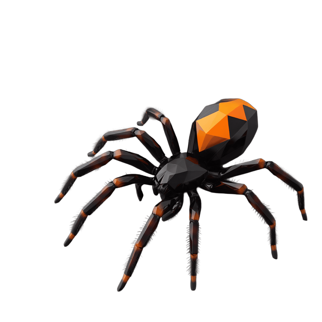
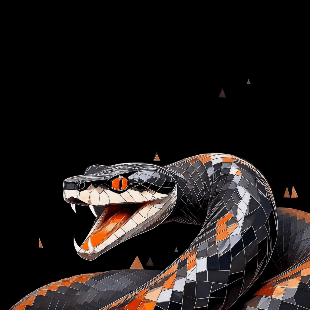
2. Geometric Predators (For Product Releases)
Each big product update is named after a predator. Imagery to support product releases should incorporate imagery of the animal in a consistent geometric style.


3. Photorealsitic Geometric Wolf Team


3. Simple illustration


4. Isometric illustrations